

Design That Disappears
Most companies want you to notice their design.
They want you to admire the colors, appreciate the icons, and remember the visual effects.
Apple wants something completely different.
It wants you to forget there is a design at all.
When people use an Apple product, they rarely say:
"What a beautiful interface."
Instead they say:
"That was incredibly easy."
That is the difference between a design that attracts attention...
and a design that achieves its purpose.
When the Product Becomes an Extension of Your Hand
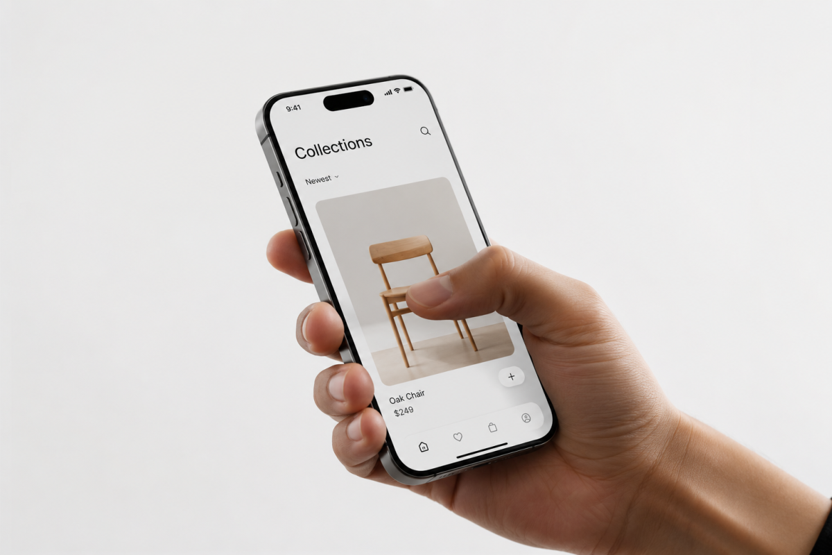
After only a few days of using an iPhone, you stop thinking about where buttons are.
You stop wondering how to navigate.
Your fingers simply know.
Your hand moves before your brain consciously decides.
That isn't habit.
That's exceptional user experience.
Great design doesn't force users to learn.
It quietly adapts to the way people naturally think and behave.
Simplicity Is Not Less Design
Many designers believe simplicity means removing everything.
Apple disagrees.
It removes only what doesn't help people accomplish their goal.
Every remaining button exists for a reason.
Every missing button disappeared for a reason.
That is the difference between minimal design...
and meaningful design.
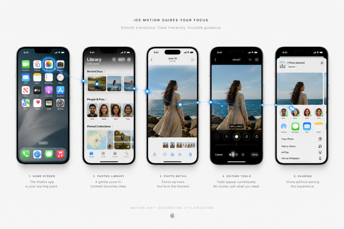
The Animation You Never Notice
Open almost any app on iPhone.
Watch how windows appear.
How cards expand.
How screens return to where they came from.
These animations are not decoration.
They are explanations.
Motion teaches your brain where things came from and where they're going.
That's why you rarely notice them.
Because they don't ask for attention.
They quietly guide it.
Design That Doesn't Shout
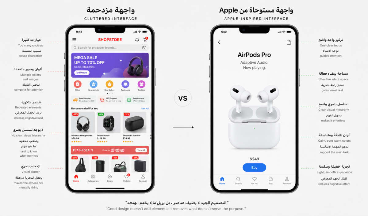
Many digital products constantly compete for your attention.
Bright colors.
Aggressive notifications.
Loud animations.
Persistent interruptions.
Apple takes the opposite approach.
It respects your attention.
Its colors remain calm.
Its animations stay subtle.
Its notifications avoid unnecessary interruption.
The interface quietly says:
"Focus on your life. I'll take care of the rest."
That isn't minimalism.
That's respect.
What If Apple Redesigned Your Favorite App?
Imagine Apple redesigned a messaging app.
Would it add more features?
More buttons?
More menus?
Probably not.
Its first question would likely be:
"What can we remove?"
Half the interface might disappear.
Yet completing your task would become easier than ever.
Because Apple's philosophy has never been about adding more.
It's about removing everything that stands between the user and their goal.
The Real Lesson for Designers
Design isn't about showing your skills.
It isn't about visual effects.
It isn't about creating more.
Design is about removing every unnecessary obstacle between people and what they want to accomplish.
If users spend time thinking about your interface...
your interface has become part of the problem.
If they completely forget it's there...
it has become part of the solution.
Conclusion
Beginner designers want people to notice their work.
Professional designers want people to notice the product.
Great designers...
want people to forget there was a design in the first place.
Perhaps that's why Apple products often feel as though they were never designed at all.
Because the greatest design...
isn't the one people admire.
It's the one that quietly disappears, allowing the experience to speak for itself.
What Can Designers Learn from Apple?
- Design the experience, not the interface.
- Remove before you add.
- Let animation explain, not entertain.
- Treat users' attention as a precious resource.
- Make the product the hero—not the UI.
- If users notice the interface more than their task, redesign it.