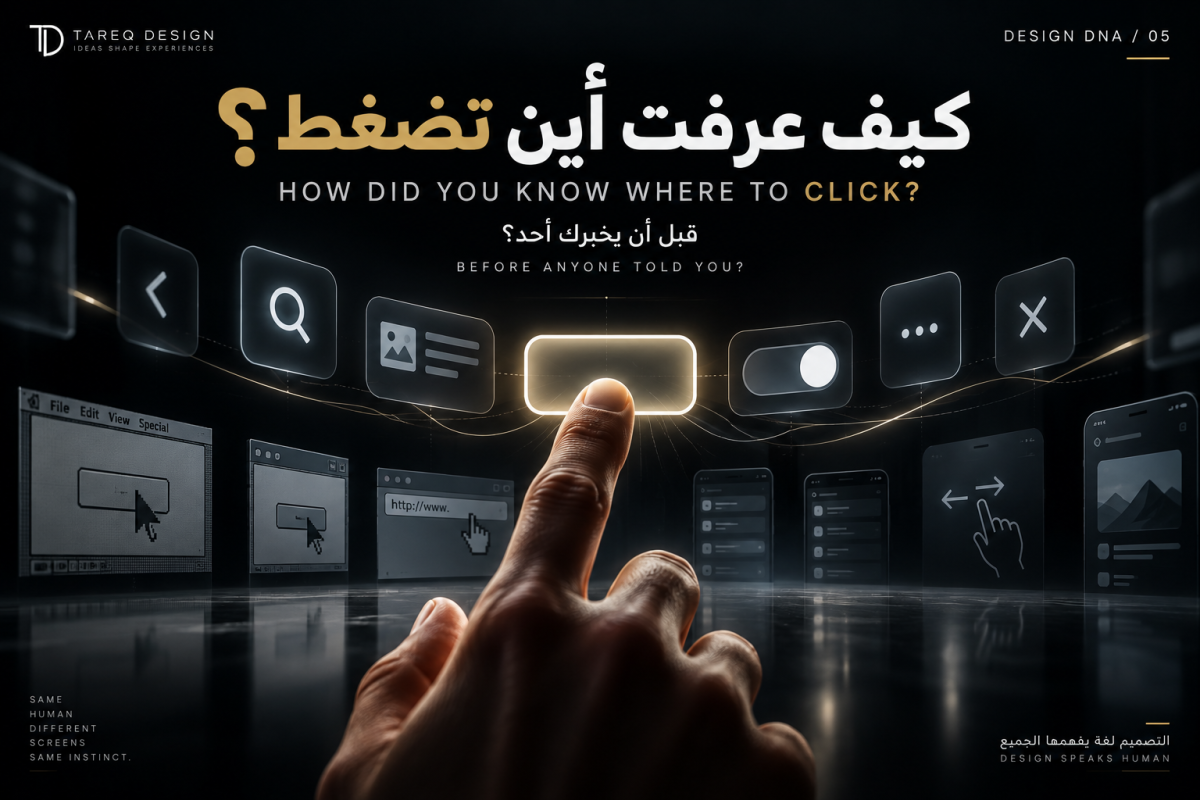



The Truth About CTA Button Colors
One of the most common questions in web design and digital marketing is:
“What is the best color for a CTA button?”
The short answer is: There isn't one.
While some studies show red outperforming green, others show blue or orange generating better results. The key factor is not the color itself but how effectively the button stands out from its surroundings.
What Makes a CTA Button Effective?
1. Contrast Matters More Than Color
A button should visually stand out from the page background and surrounding elements.
2. Match Your Brand Identity
Choose a color that supports your brand rather than forcing a trend.
3. Clear Messaging
A strong CTA message is often more important than the button color itself.
4. Test and Optimize
The best-performing color depends on your audience, industry, and design context.
Common CTA Color Associations
🔴 Red — Urgency and limited-time offers.
🟢 Green — Progress, positivity, and trust.
🔵 Blue — Reliability and security.
🟠 Orange — Energy and action.
🟡 Yellow — Attention and optimism.
Conclusion
The best CTA button color is not red, green, or blue. It is the color that creates the strongest visual contrast, aligns with your brand, and guides users toward the desired action with clarity and confidence.